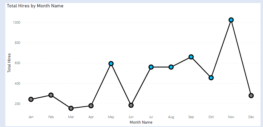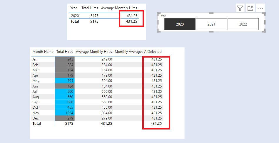
We want to highlight the Months in a Year with the above and below average total hires.
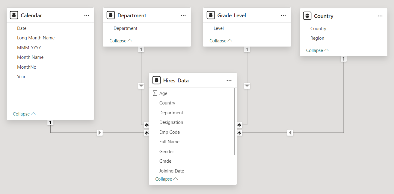
Our Data Model contains four tables Calendar,Department, Grade_Level,Country and Hires_data.
The dimension tables are Calendar, Department, Grade_Level, Country. The fact table is the Hires _data table.
- The Calendar table is the date table in our dataset.
- The Grade_Level table has a list of all the available grade levels in our dataset.
- The Department table has a list of all the available departments in our dataset.
- The Country table has a list of all the available countries in our dataset.
- The Hires_data table has details for all our newly hired employees. We have details like the department, gender, grade, designation, joining date , country and many more data.
The dimension table are connected to our Hires_Data table in a one to many relationship.
We want to highlight the months with Above and Below Average Hires in a year.
First, we create a measure called Total Hires.

Next, we create the measure Average Monthly Hires.

To calculate the Monthly Hires across All Selected years . Create a new measure Monthly Averages AllSelected.

To highlight the Above Average/Below Average Hires we need to compare the Total Hires with Above Average/Below Average Hires.
Create a new measure called Check Above Below Averages

Matrix Highlighting
Add a Table visual to the report. In columns add Month Name and below it add the measure Total Hires. Now Add measure Monthly Averages AllSelected below it.
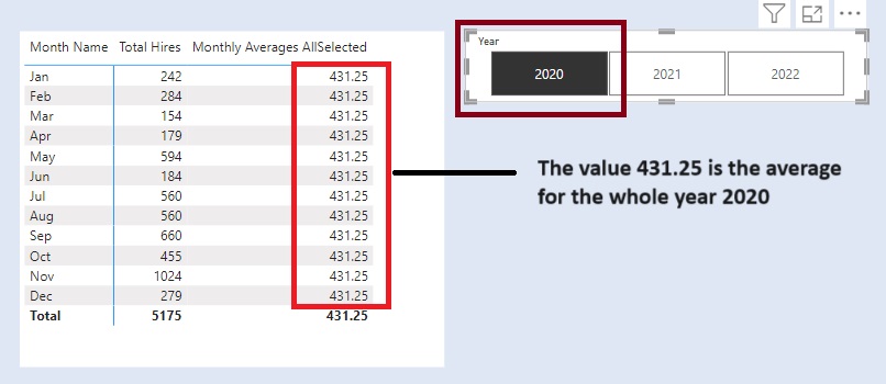
To highlight the values . Remove the measure Monthly Averages AllSelected from the table.
Go to visual –> Cell Elements –> Series (Total Hires) –> Background Colour.
In the conditional formatting , add the measure Check Above Below Averages
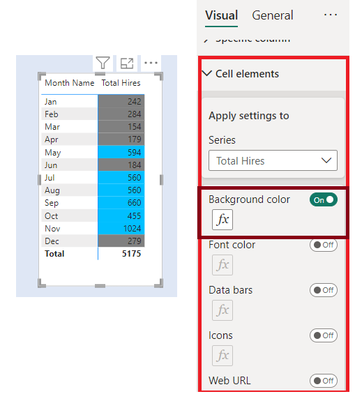
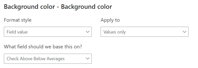
Column Chart Highlighting
Add a column visual. In X Axis add Month Name. In Y Axis add Total Hires.
To highlight the values. Go to visual –> Columns –> Colours
In the conditional formatting, add the measure Check Above Below Averages.
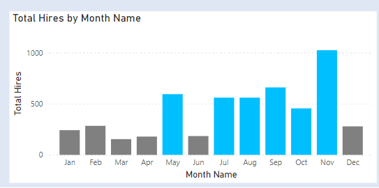
Line Chart Highlighting
The Line chart does not have the conditional formatting for markers / lines. To achieve the conditional formatting, we first create the column chart with conditional formatting and then convert it to Line Chart.
Change the colour of the line and the markers size .
