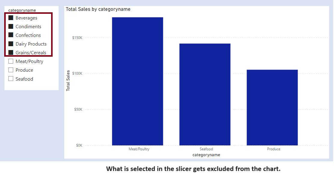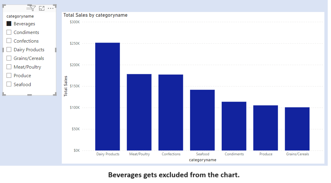
We have two slicers for Categories. We select one Category from Slicer 1. The concerned category gets excluded from the other Category from Slicer 2.
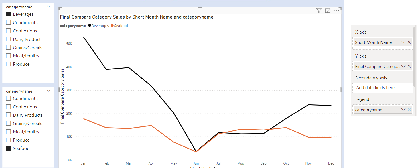
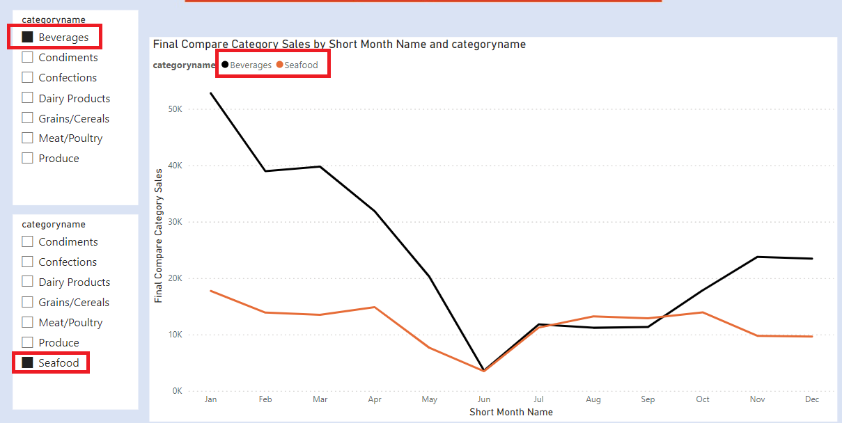
We can select one Category from slicer 1 and other Category from slicer 2. This will allow us to compare two different categories against each other.
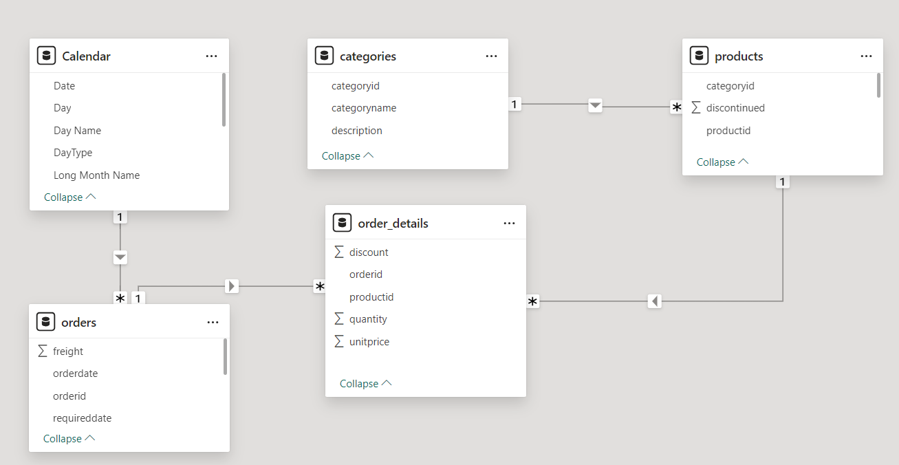
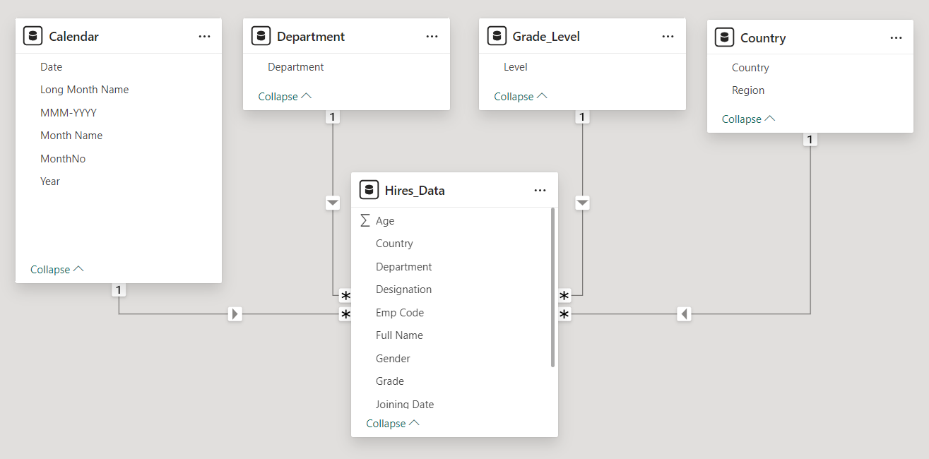
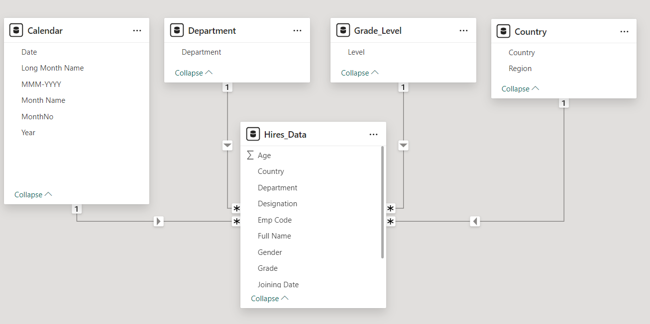
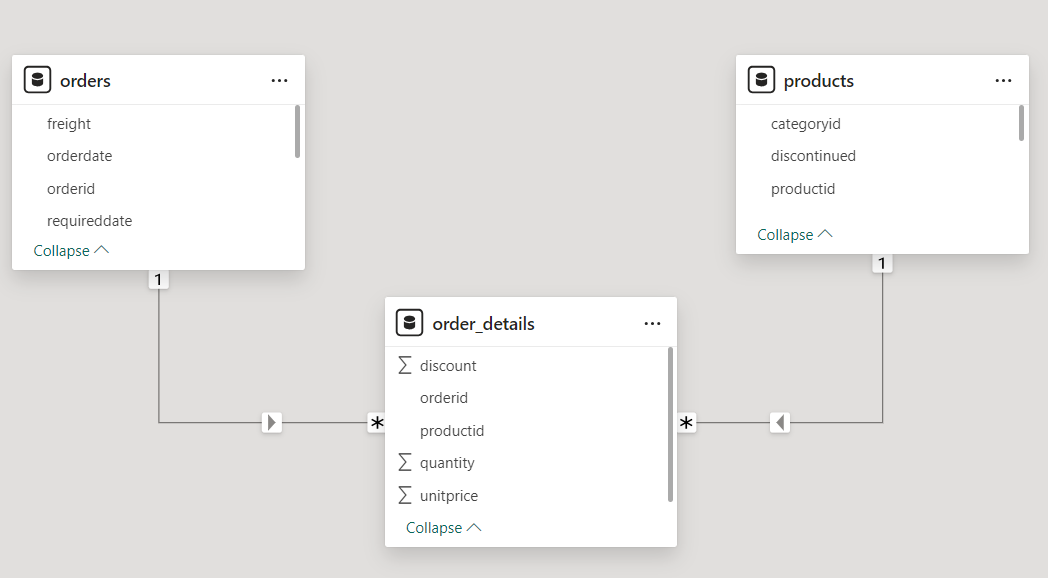
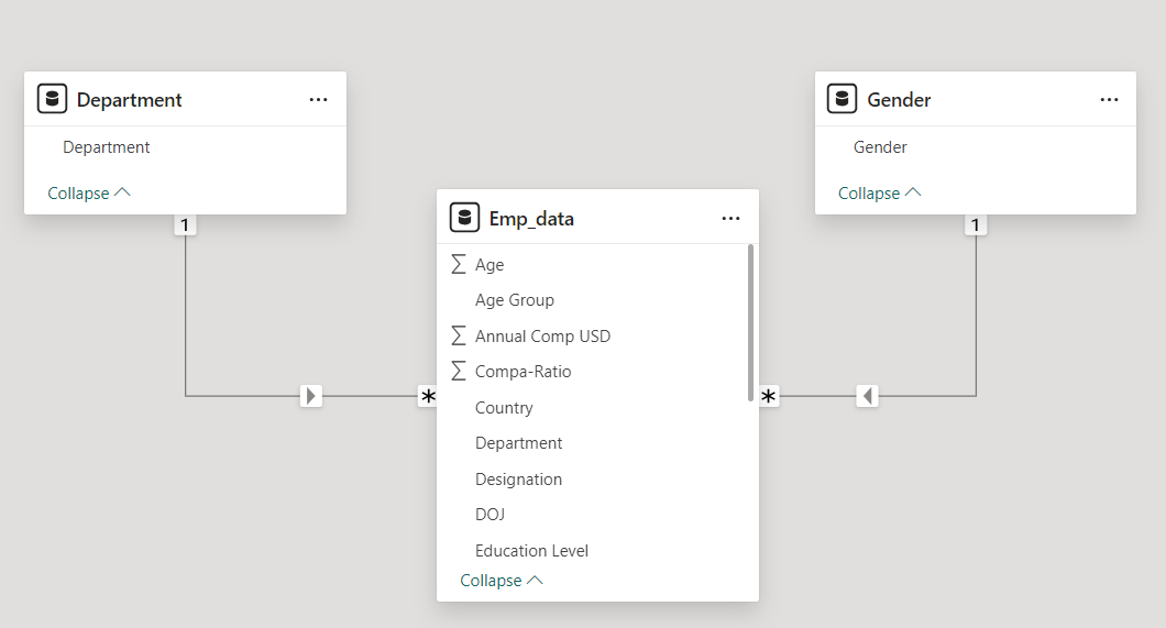
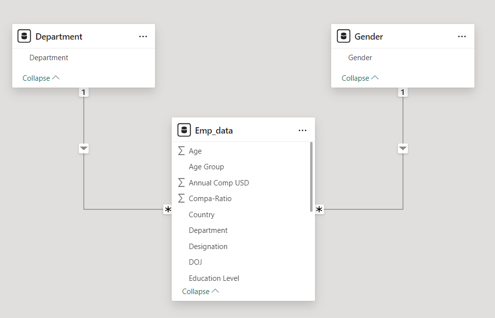
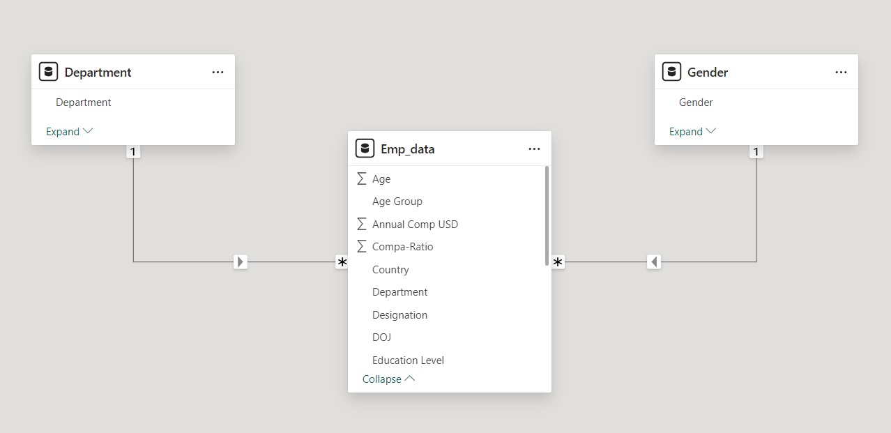
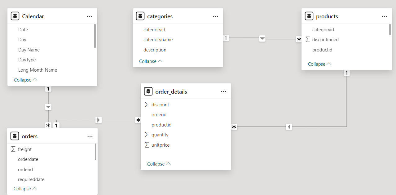
Our Data Model contains three tables Orders, Products and Order_Details.
The dimension tables are Orders, Products. The fact table is the Order_Details table.
- The Orders table has details of all the orders in our dataset
- The Products table has details of all the products in our dataset
- The Order_Details has line item details of the orders.
- The Calendar Table is our date table
- The Categories has details of all the categories in our dataset
The Orders, Products table are connected to our Order_Details table in a one to many relationship.
The Calendar table is connected with our Orders Table in a one to many relationship.
The Category Table is connected with our Products Table in a one to many relationship.
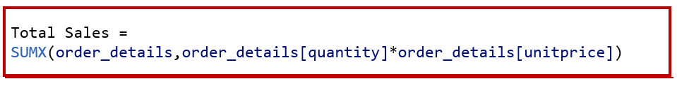
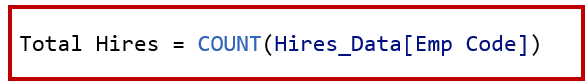
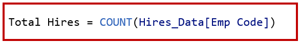
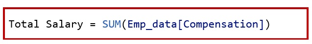
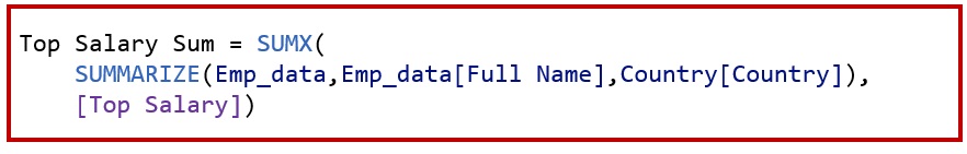
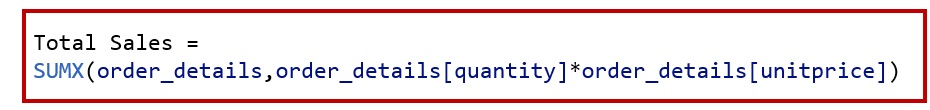
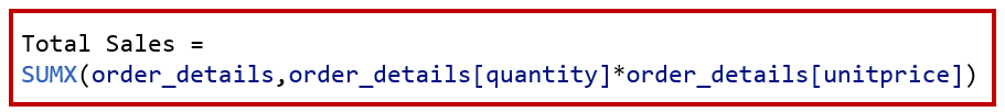
Create a measure called Total Sales.
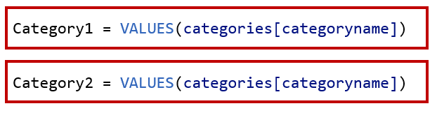
Create two tables called as Category1 and Category2.
Add two slicers and add categoryname( from Category1 table) in one slicer . In the other slicer add categoryname( from Category2 table)
This will allow to compare if a selection in the first slicer is also selected in the second slicer.
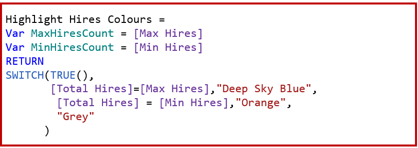
Now to calculate the sales of the selected category , create a measure called Check Selections.

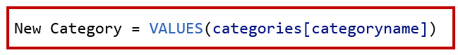
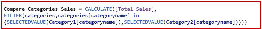
As our Category 1 and Category 2 table are disconnected tables. We create a measure called Compare Categories Sales to check if either of our selection [categoryname] from Category 1 and Category 2 table is same as the [categoryname] Category from our Category table.
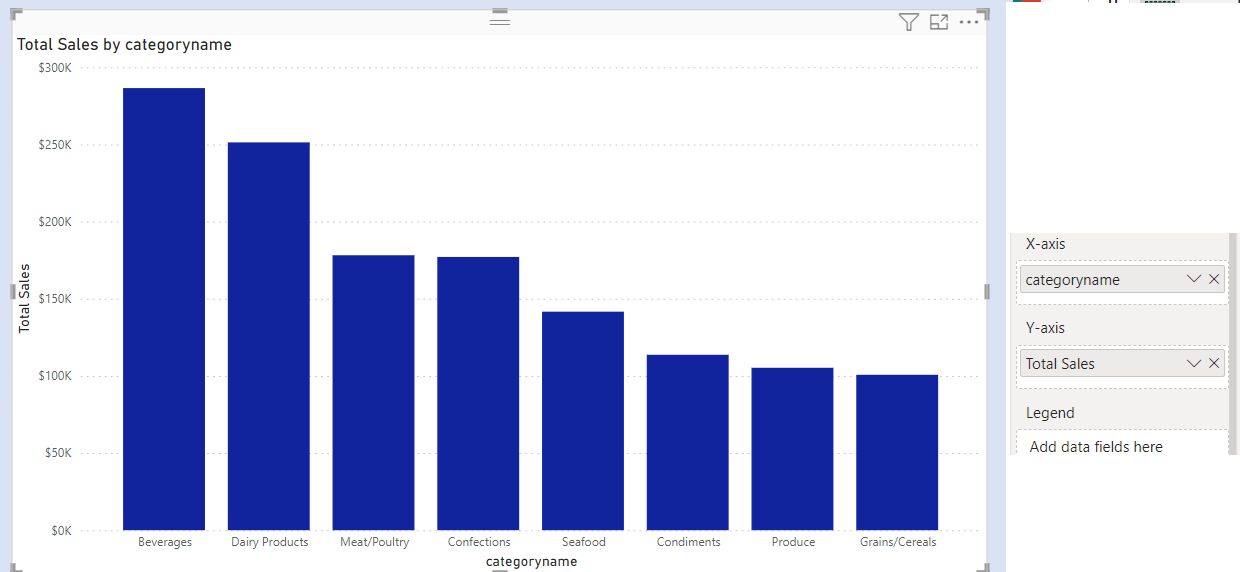
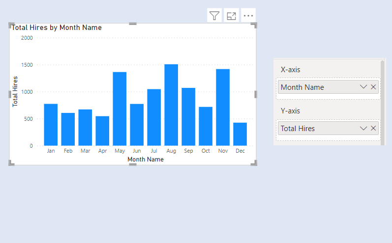
Add a column chart . In X Axis add Short Month Name and Y Axis add Compare Categories Sales.
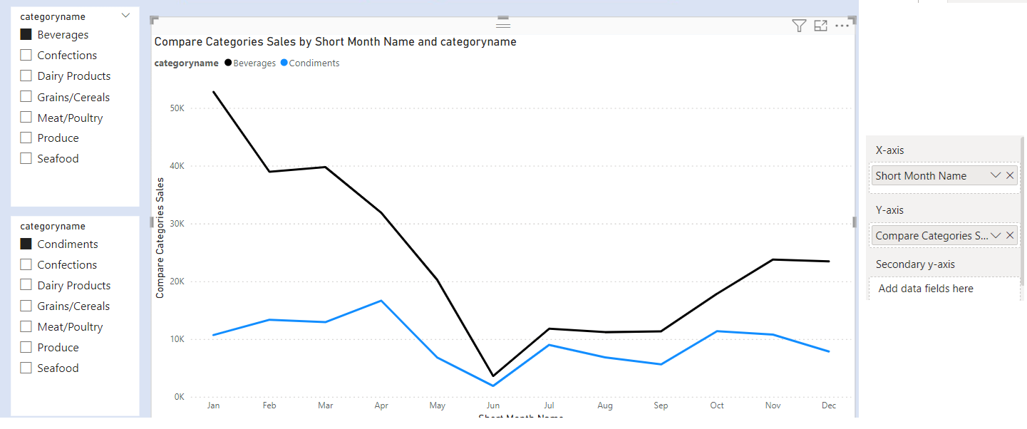
However, if you do not select anything from both slicers , our chart will be blank.
![]()
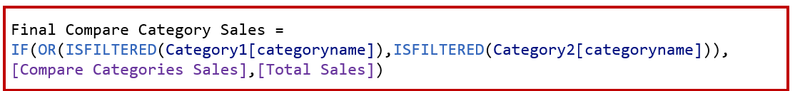
To solve this, we create a new measure called Final Compare Category Sales.
Add a column chart . In X Axis add Short Month Name and Y Axis add Final Compare Category Sales.
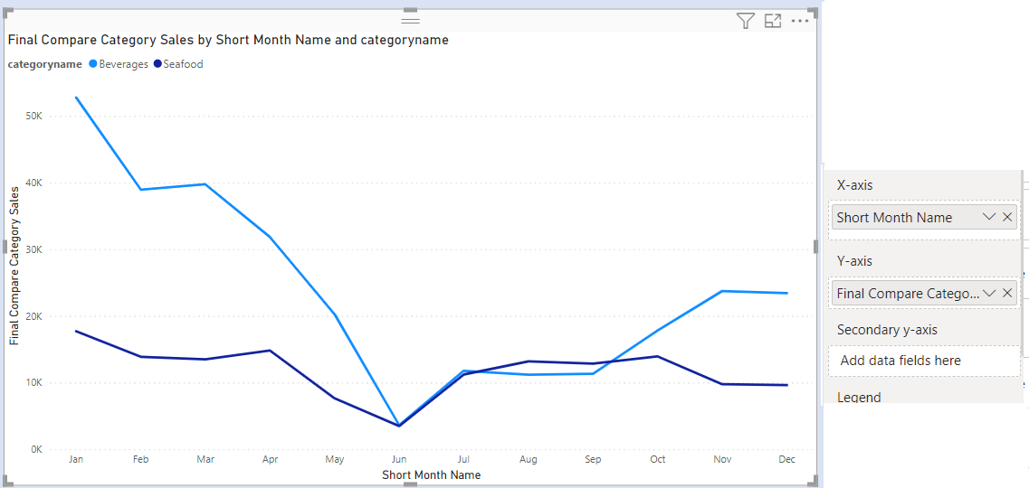
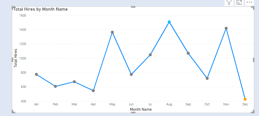
The final chart after formatting colours is as below.