Tag Archive | Totals

Highlight Months with Above/Below Avg Hires

We want to highlight the Months in a Year with the above and below average total hires.

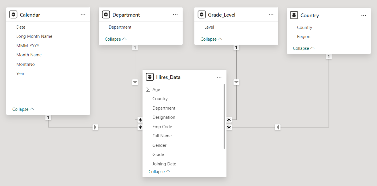
Our Data Model contains four tables Calendar,Department, Grade_Level,Country and Hires_data.

The dimension tables are Calendar, Department, Grade_Level, Country. The fact table is the Hires _data table.

  • The Calendar table is the date table in our dataset.
  • The Grade_Level table has a list of all the available grade levels in our dataset.
  • The Department table has a list of all the available departments in our dataset.
  • The Country table has a list of all the available countries in our dataset.
  • The Hires_data table has details for all our newly hired employees. We have details like the department, gender, grade, designation, joining date , country and many more data.

The dimension table are connected to our Hires_Data table in a one to many relationship.

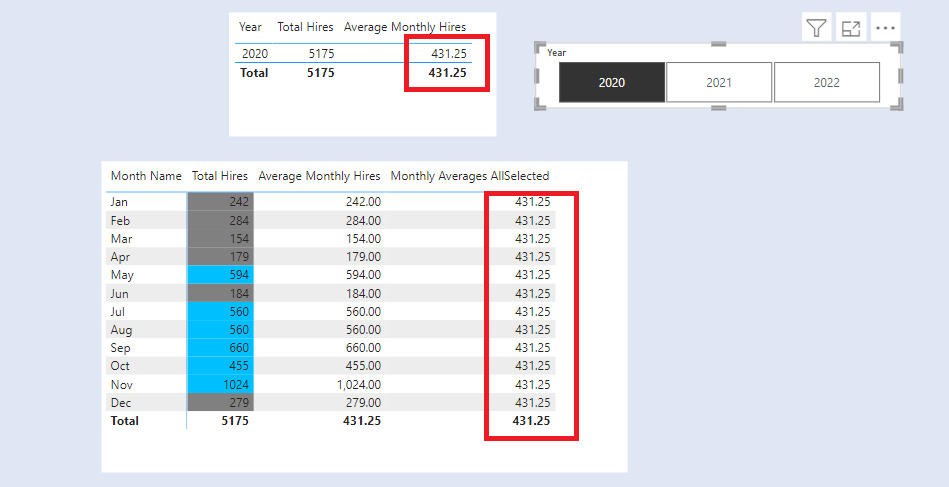
We want to highlight the months with Above and Below Average Hires in a year.

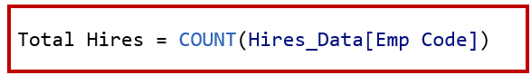
First, we create a measure called Total Hires.

Next, we create the measure Average Monthly Hires.

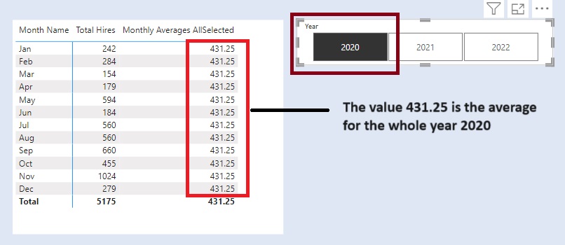
To calculate the Monthly Hires across All Selected years . Create a new measure Monthly Averages AllSelected.

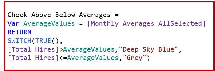
To highlight the Above Average/Below Average Hires we need to compare the Total Hires with Above Average/Below Average Hires.

Create a new measure called Check Above Below Averages
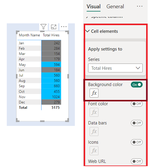
Matrix Highlighting

Add a Table visual to the report. In columns add Month Name and below it add the measure Total Hires. Now Add measure Monthly Averages AllSelected below it.

To highlight the values . Remove the measure Monthly Averages AllSelected  from the table.

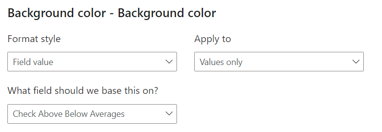
Go to visual –> Cell Elements –> Series (Total Hires) –> Background Colour.

In the conditional formatting , add the measure Check Above Below Averages

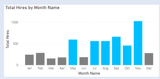
Column Chart Highlighting

Add a column visual. In X Axis add Month Name. In Y Axis add Total Hires.

To highlight the values. Go to visual –> Columns –> Colours

In the conditional formatting, add the measure Check Above Below Averages.

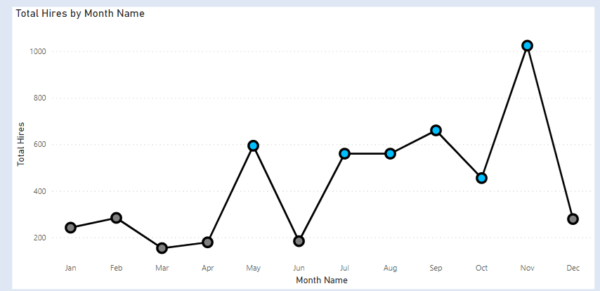
Line Chart Highlighting

The Line chart does not have the conditional formatting for markers / lines. To achieve the conditional formatting, we first create the column chart with conditional formatting and then convert it to Line Chart.

Change the colour of the line and the markers size .


Percent of Grand Total

We want to calculate the percentage contribution of headcount across departments for the overall data.

Our Data Model contains three tables Department, Gender and Emp_data.

The dimension tables are Department and Gender. The fact table is the Emp_data table.

  • The Department table has a list of all the available departments in our dataset
  • The Gender table has a list of all the available gender categories in our dataset.
  • The Emp_data table has details for all our active employees. We have details like the department, gender, grade, designation, joining date , country and many more data.

The Department table and the Gender table are connected to our Emp_Data table in a one to many relationship.

What is Percent of Grand Total

The below table gives us the count of employees across Department by Gender.

We have a total of 32977 employees and the breakdown of employees by Department

For Percent of Grand Total, we need to find out the % values of employees across Departments. The sum of all the values across entire matrix needs to be 100%.

If we individually look at the Department% and sum the %values of Gender in each Department. It would be equal to the sum of the Department%

Our result must be as under:

What the above tables states is that:

  • Customer Service accounts for 4.5% of employees,
    • Of which females account for 2.8%
    • Males account for 1.6%
    • Undisclosed accounts for 0.1%

If we sum the individual gender% for each department, it will sum up to the %value for that department.

To achieve the below we need to calculate three measures

Calculate the Headcount in our dataset. Create a new measure. Name it as Headcount.

Next, we need to calculate the Grand total. So we will create a new measure. Name it as Grand Total.

As we want the overall grand total. We remove filters on the Department and also on the Gender.

Finally, we need to calculate the Percent of grand total by dividing the Headcount by the Grand Total.

So create a new measure. Name it as Percent of Grand Total.Format it as %.

Add a matrix visual to your report.

In rows add Department (from Department table) and below it in rows add Gender ( from Gender table). In values add Percent of Grand Total.

The resultant matrix is our Percent of Grand Total.

To view a video tutorial. Refer below.


Percent of Column Total

We want to calculate the percentage contribution of the columns. In our example the we want to calculate the percent contribution of gender across Department.

Our Data Model contains three tables Department, Gender and Emp_data.

The dimension tables are Department and Gender. The fact table is the Emp_data table.

  • The Department table has a list of all the available departments in our dataset
  • The Gender table has a list of all the available gender categories in our dataset.
  • The Emp_data table has details for all our active employees. We have details like the department, gender, grade, designation, joining date , country and many more data.

The Department table and the Gender table are connected to our Emp_Data table in a one to many relationship.

What is Percent of Column Total

The below table gives us the count of employees across Department by Gender

E.g Gender : Female

We have a total  of 4463 female employees and the breakdown of female employees by Department

For percent of column total we need to find out the % values of female employees across Departments. The sum of all the values needs to be 100%

Our result must be as under:

What the above tables states is that in Female Gender.

  • Customer Service accounts for 21% female employees,
  • Finance & Accounts accounts for 13% female employees,
  • Human Resource accounts for 6% female employees
  • And so on……….

The Total is 100% for females.

Similarly for Male employees , we get the %breakdown for male employees by Department.

And similar for Undisclosed Gender.

To achieve the below we need to calculate three measures

Calculate the headcount in our dataset. Create a new measure. Name it as Headcount .

Next we need to calculate the Column total. So we will create a new measure. Name it as Column Total.

As we want the % across Gender, we need to remove the filters across the Department.

Finally, we need to calculate the % of Percent of column total by dividing the headcount by the column total.

So create a new measure. Name it as Percent of Column Total. Format it as %.

Add a matrix visual to your report.

In rows add Department (from Department table). In columns add Gender (from Gender Table). In values add Percent of Column Total

The resultant matrix is our percent of parent column total.

To view a video tutorial. Refer below.